
*********************************************************************************
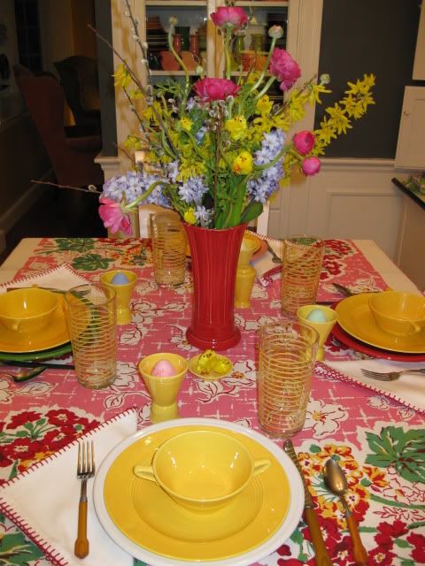
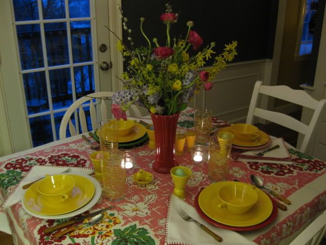
Easter doesn't have to be pastel. I found this mint-with-tag tablecloth in Vermont last weekend, and it's perfect for an Easter table that mixes bright, bold colors with Spring's softer hues.

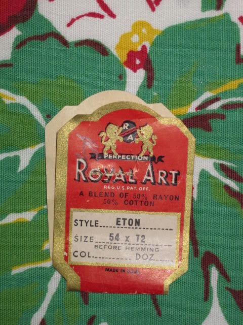
The cloth is by Royal Art and the pattern is called Eton. I associate that name with an exclusive British boys' school, but I guess Royal Art felt it worked for these florals, too.
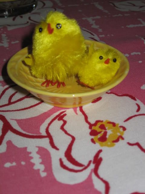
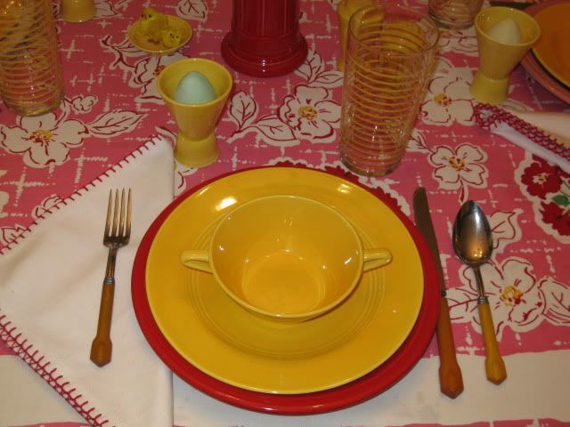
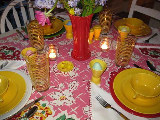
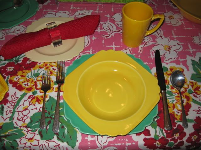
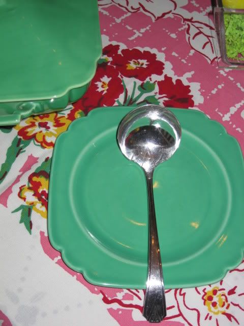
This tablescape features post-86 Fiesta dinnerware in white, shamrock, rose and scarlet paired with vintage Harlequin dinnerware in yellow. Last week's table was all about rabbits. This week the chicks have landed on my tabletop, and Harlequin yellow is a perfect match for their fluffy feathers!
The forsythia in the centerpiece is from our yard. The rest of the blossoms are from the farmstand. The smell of the hyacinths is wonderful!
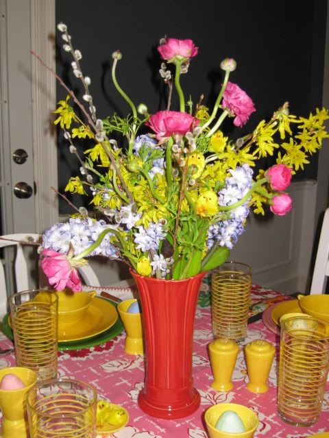

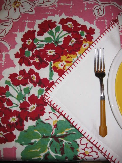
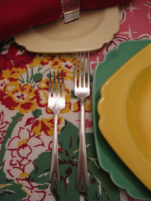
Vintage Bakelite flatware, modern Libbey stripe glassware and napkins from Pier One complete this table.
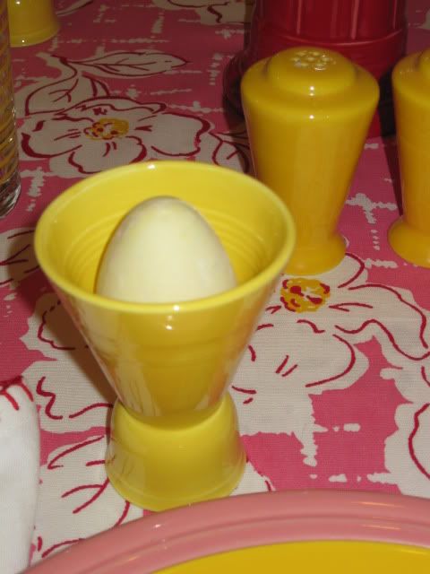
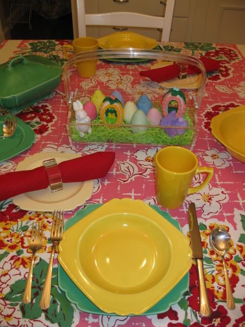
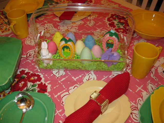
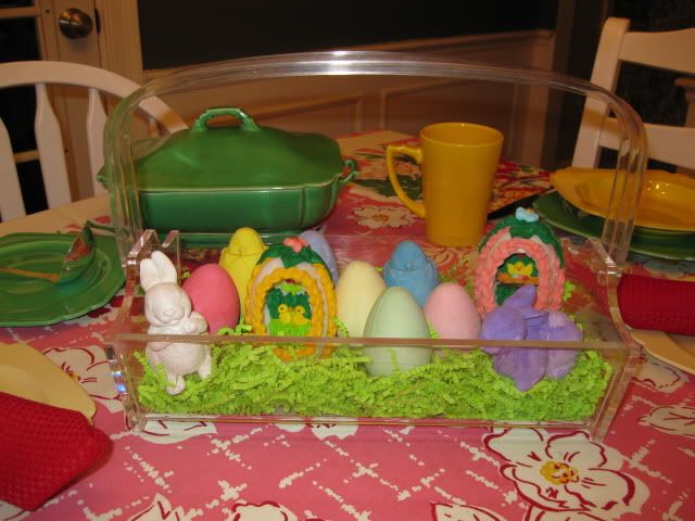
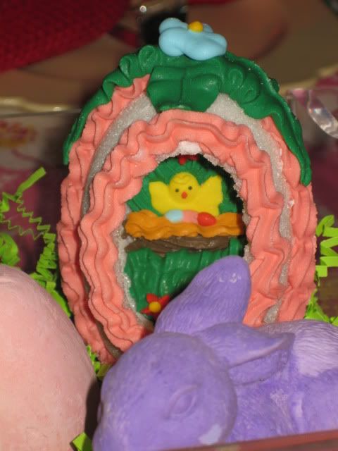
Can you guess what these eggs are made of?
The colors also work well in candlelight.
I've been enjoying this tablecloth so much that I decided to give it a second 'scape using vintage Riviera dinnerware and a vintage lucite basket.
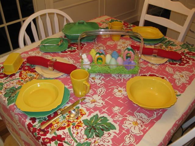
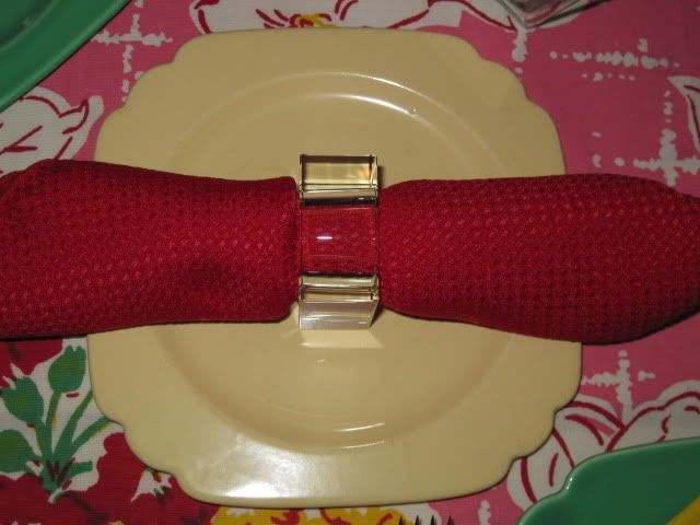
The basket is from Maine. I love how it looks with these contemporary napkin rings that I brought home from Bloomingdale's the last time I was in Manhattan.
I guess this is truly a town and country combination!
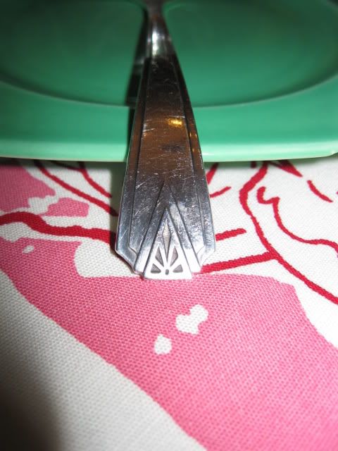
The flatware is Oneida Deauville silverplate.
The Art Deco design is very popular with collectors of Homer Laughlin's Fiesta, Harlequin and Riviera.
The basket is perfect for the holiday.


Thanks for stopping by for another Easter Tabletop Time. I'd love to know which table you prefer -the Fiesta and Harlequin with the floral arrangement or the Riviera with the lucite accents.


Both are fun Daphne! What great colors and I'm lovin' the chicks in your centerpiece! Great find on the tablecloth-enjoy:@)
ReplyDeleteYou're right, the brighter colors are perfect for the Easter Season.
ReplyDeleteFun, cheerful and so cute! Most people don't use those colors for Easter, but how perfect they are!
ReplyDeleteBeautiful colours! Great table...I love the tbcloth, the plates and the center piece...such happy and cheery table.
ReplyDeleteFABBY
Hi Daphne...
ReplyDeleteI love your vintage tablecloth, my friend...what a great treasure find! I think it looks beautiful used for an Easter tablescape too! I love the bright colors! I tend to always go with the brighter colors more than the pastels just because of the colors in my dining room! Love your bright place settings too! Ohhh...and I thought that adding those sweet little, fluffy chicks into your floral arrangement was awesome! Love, love, LOVE the pretty flowers! I also liked your clear basket filled with Easter pretties too! Both tables were sooo pretty, my friend! Thank you so much for sharing them with us for the Sunday Favorites repost party this week!!! Your pretty tables are always a "treat" to see!!!
Happy spring wishes...
Chari @Happy To Design
They are both beautiful. Are they eggs chaulk?
ReplyDeleteThanks for stopping by! Yes, the eggs are chalk.
ReplyDelete