Sunday, June 27, 2010

Summer Celebrations

We're back home from vacation, and there are many things to celebrate on the tabletop today with this vintage Wilendur Manjares tablecloth in the yellow colorway.

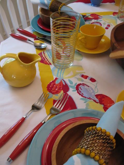
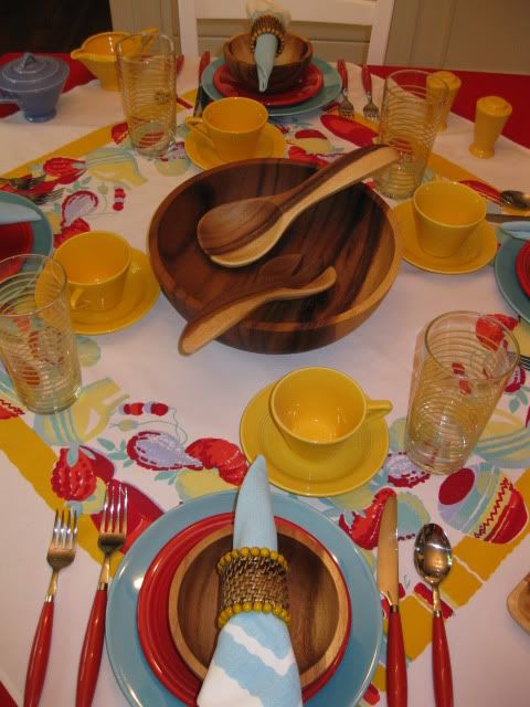
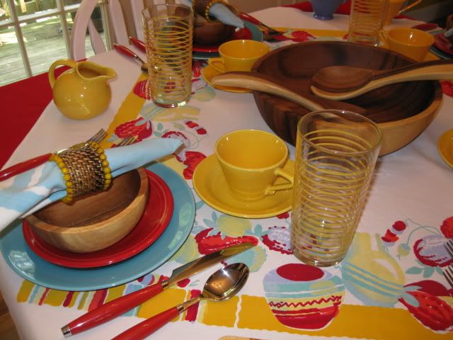
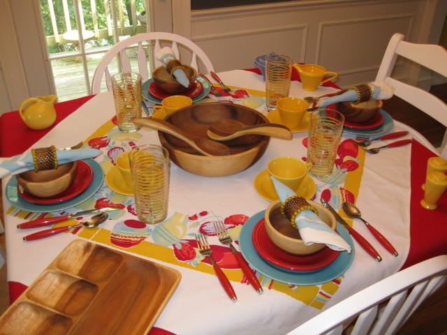
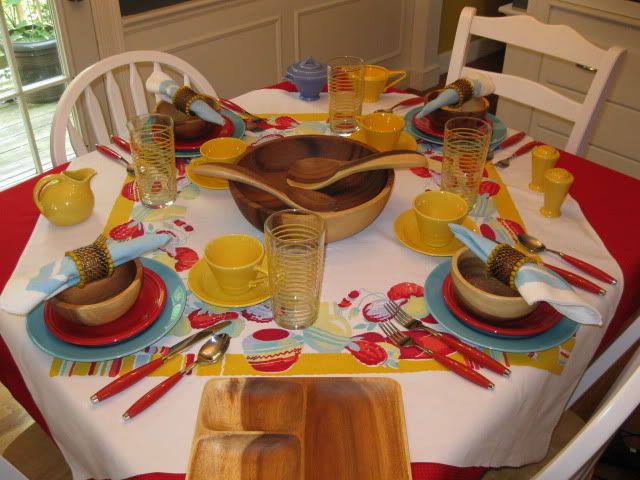
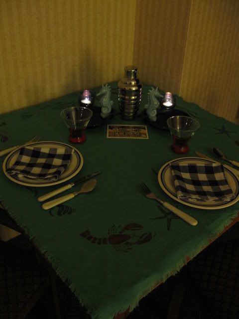
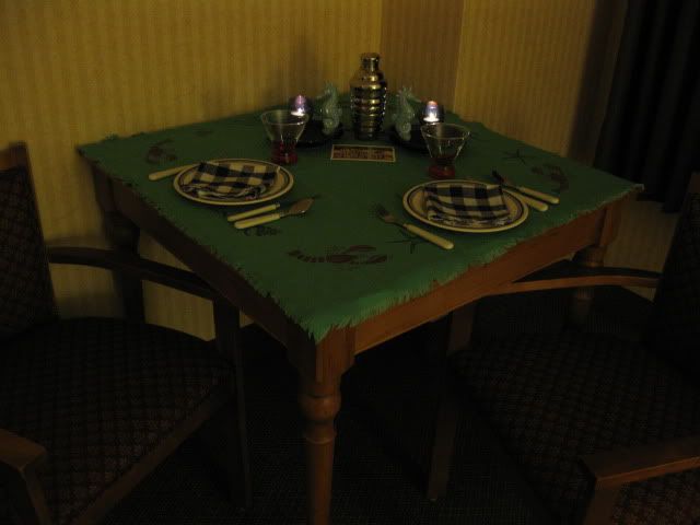
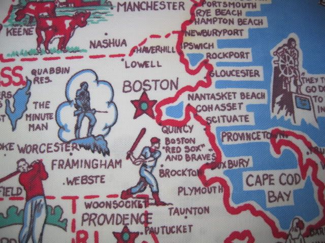
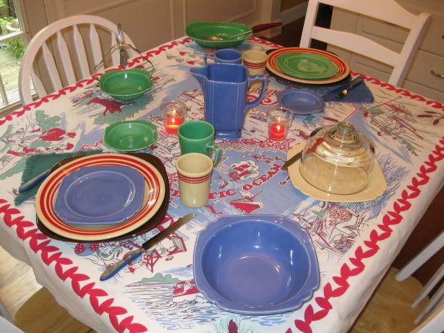
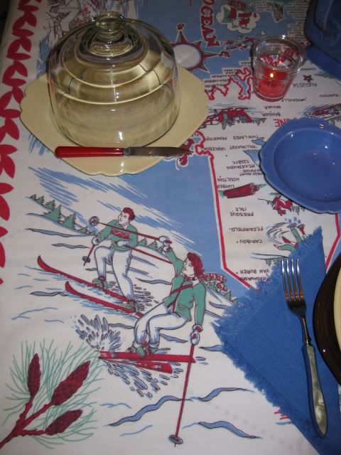
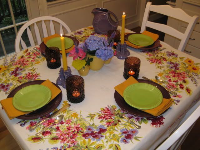
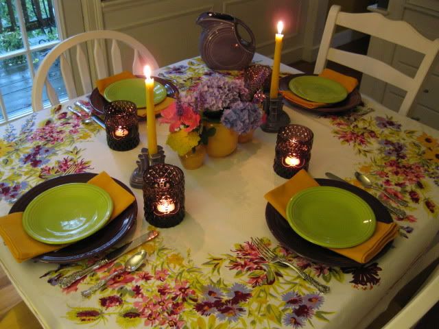
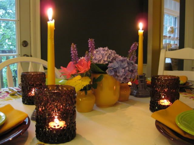
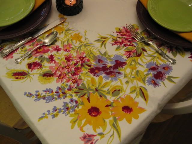
First, let's celebrate Summer shopping. The cloth came from the May Brimfield show. Technically I guess that is late spring, but it's definitely worth celebrating! I found these lovely wicker napkin rings with yellow bead trim at a shop in Dartmouth, Massachusetts, my husband's hometown, last weekend.


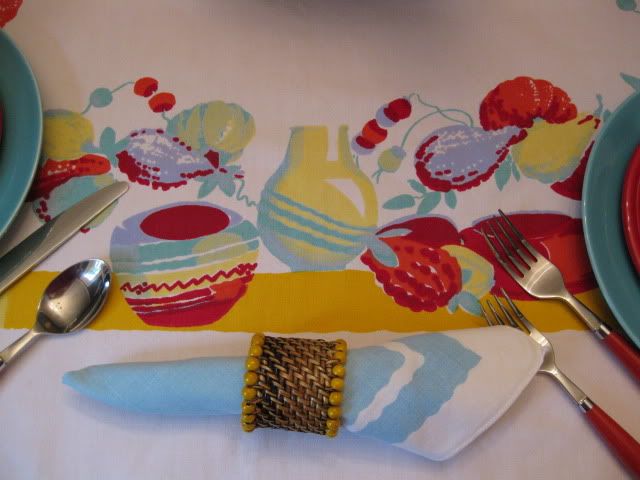
While on vacation this week, I found four turquoise Harlequin dinner and salad plates. I tend to stockpile cloths at Brimfield, and I never really know when I'll use them on a table. The finding of the napkin rings and the plates was the sign that today is the day for this lovely textile design from 1940.


But then this Summer celebration also requires a Summer confession. I must admit that I no longer collect, "only yellow Harlequin!" I feel better now that I've faced that fact, so let's get back to the celebrations!

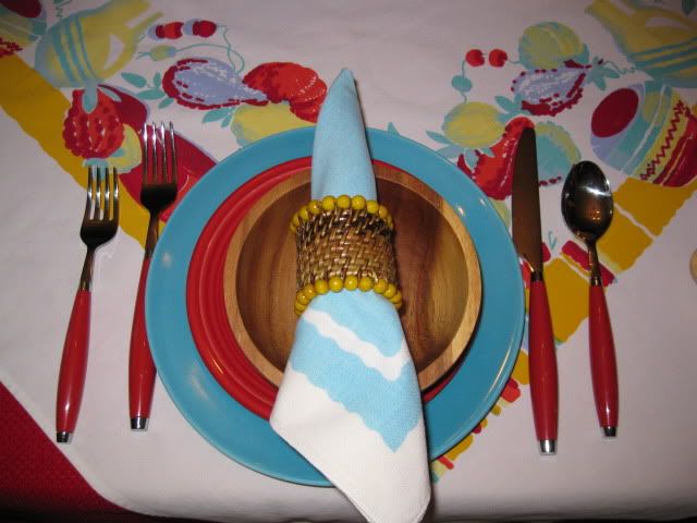
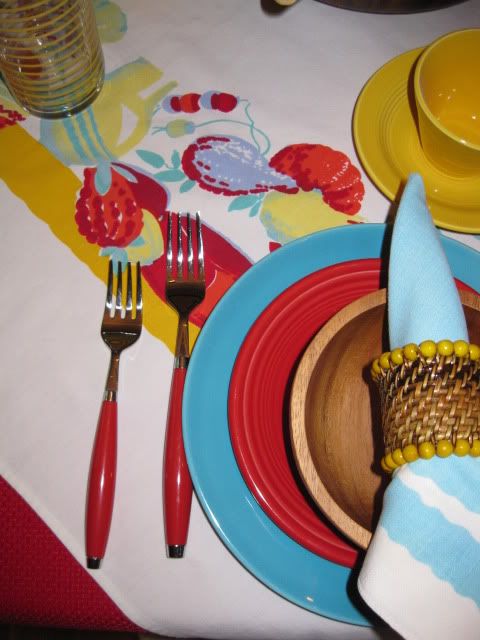
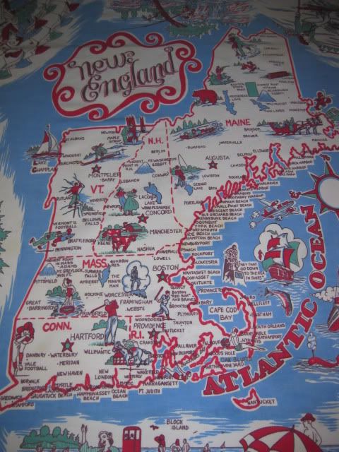
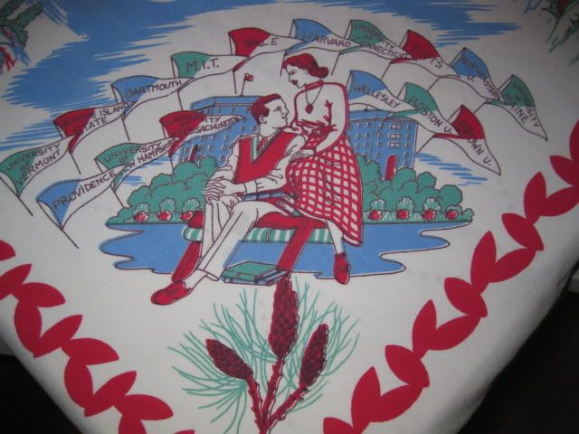
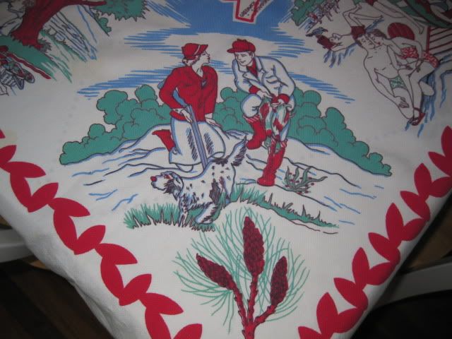
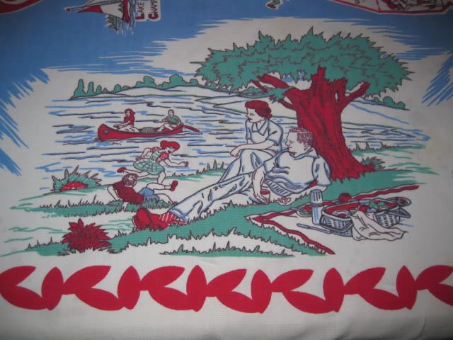
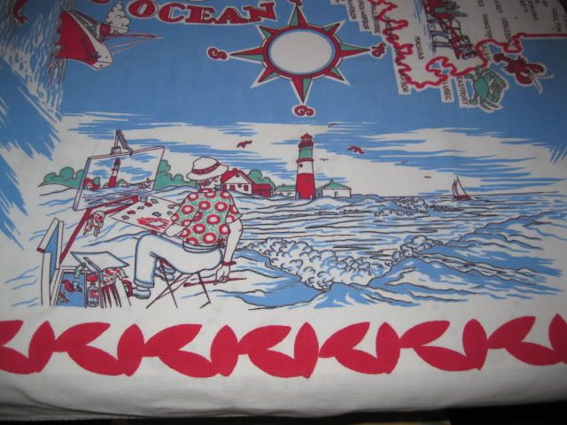
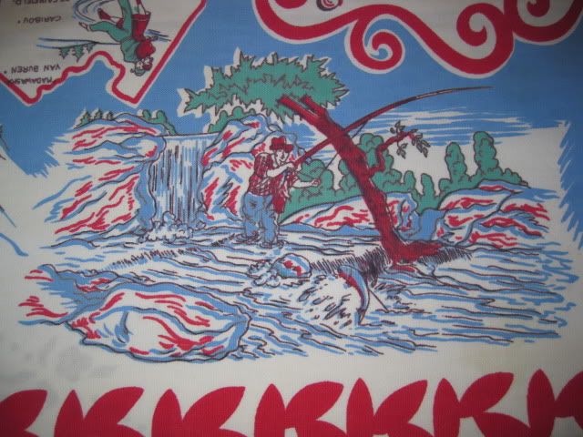
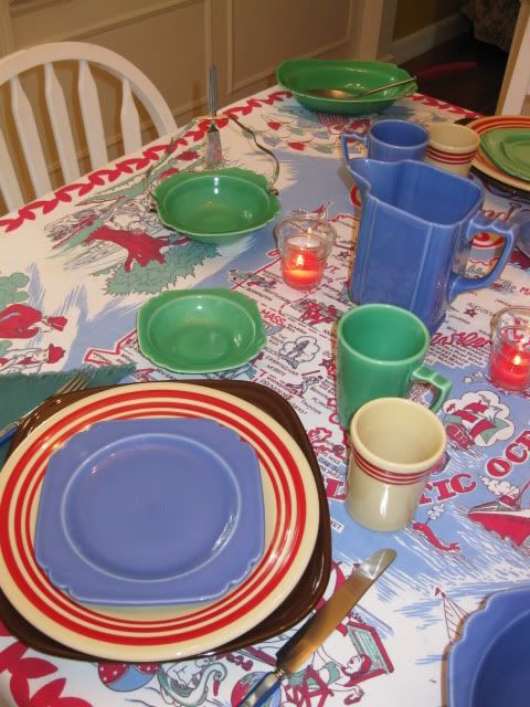
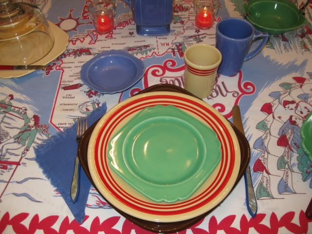
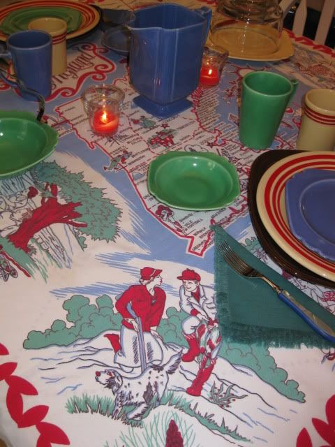
This week on the website of the Vintage Tablecloth Lover's Club, a member shared a very special article about her father, John Madsen, who was a designer for the Weil & Durrse company, better known as Wilendur. This touching and informative account of Mr. Madsen's work discussed how he worked from home but would often have to take the train in from New Jersey to the company offices in New York to make changes to the colors on the tablecloths as his design was being transferred from paper to cloth. Notice how well the colors in Manjares coordinate with the vintage yellow, turquoise and blue Harlequin.


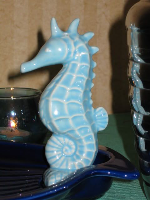
I included this touch of blue to illustrate this point. I wonder if any of the changes that Mr. Madsen had to make were due to the fact that Wilendur kept sample dishes in their offices to help with this colorific coordination? And now that my dish confession is behind me, I can share that I have a good bit of Harlequin blue to go along with the yellow and the turquoise...then there's the reissue...and the gray plates....but I digress!


Let's celebrate the amazing work of John Madsen for Wilendur!


Do you feel like we're building up to something special here? I do hope so, because the third tabletop celebration for this Summer Sunday is a hearty Happy Birthday to Elaine, my friend who taught me about the wonderful world of Wilendur!


All best birthday wishes, Elaine! I hope you had a super day.

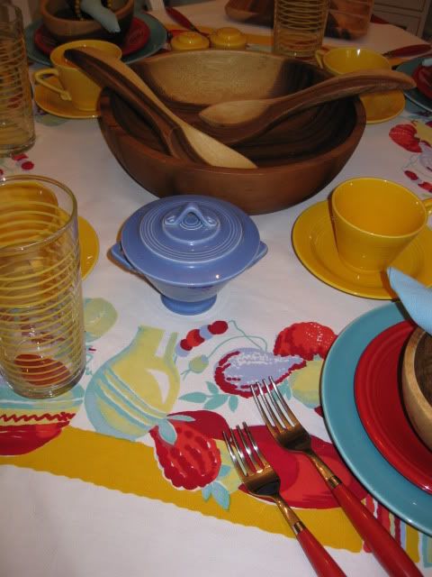
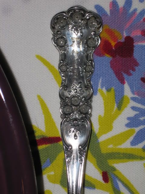
The other items on this table include yellow stripe Libbey glasses, Fiesta flatware and salad plates in scarlet, a wooden salad set from Crate & Barrel that we received as a wedding gift and vintage napkins from Elaine!

Please do join all the other tablescapers to hear about their Summer Sundays at
The Tablescaper!

Thursday, June 24, 2010

Tabletop Greetings from Newport!

This week's tabletop comes to you from Newport, Rhode Island. I decided to take things on the road so that I can keep up with the blog while also making the most of summer!


This vintage tablecloth adds a lot of cheer to our hotel room, with a little help from the plastic dishes, flatware and plaid napkins from our picnic pack.


Candles set the mood for cocktails after a day at the beach.


The picnic pack is so handy when we want to bring home some appetizers from the clam shack before heading out to supper.

These blue Hall shell dishes look great with the seahorse salt and pepper shakers I found at the shop of the Newport Preservation Society.


I do love a sea-themed table! They bring back such good memories of scenes like this.


Thanks for stopping by for some Tabletop Greetings from Newport! I'll be sharing this travelling table in a better-late-than-never entry for Tablescape Thursday on Between Naps On The Porch.

Can you followers believe that I set a table with no Fiesta this week? I almost said "no Homer Laughlin," but now that Homer owns Hall, I guess that's not really true!

Thursday, June 17, 2010

Summer Vacation

I really love Summer tables, but the season does present a bit of a paradox for a blogger. Summer suppers provide wonderful opportunities for tabletop time, but Summer vacation means I'm not sitting by the computer as frequently as during the New England winter. Luckily, we're home this week and expecting that other bounty of summer...visitors! I love to welcome friends with souvenir cloths from the area. Here's a super New England-themed cloth. The graphics are so special that they deserve some close ups before setting the table.


Both Braves and Red Sox fans live here, so this cloth is especially welcomed to the table! We can date this cloth to pre-1953, when the Boston Braves moved to Milwaukee. In addition, I work in Higher Education, so I was really drawn to this corner with college pennants.


Now that we've seen vacation options for every season, shall we set the table? I collect tablecloths to showcase my dishes. You may not see new and different dinnerware on each table here, but I hope you will enjoy seeing unique combinations that celebrate the re-use of vintage and American-made contemporary pieces again and again. Today let's play with two of my very favorite lines, Riviera and Retro Red Stripe Fiesta dinnerware!


Working with souvenir tablecloths is a little different from setting the table with a floral, fruit or novelty cloth that creates a symetrical layout for the table. I often reserve souvenir cloths for a table for two so that we can enjoy more of this asymetrical design.


The placesettings feature square Fiesta dinnerware in chocolate, retro red stripe dinner plates & tumblers, and blue and green Riviera plates, mugs & fruit bowls with Bakelite flatware. Riviera serving pieces complete the table.

Tomorrow friends will be over for supper, so we'll be setting the table for four. I think I'll wait and do it after they arrive so that they can see the full beauty of this cloth!

It's been a while since I could sync up my shedule for Tablescape Thursday, but I'm glad to be sharing this table with the folks at Between Naps On The Porch.

I'm also excited to share this post for my first Summer Sunday with The Tablescaper! Please do check out these wonderful expressions of this special season.

Sunday, June 6, 2010

Summer Shimmer

Last week I wrote about summer simplicity, but I can't be content with an uncluttered table for long. This table celebrates regal purples and golds with my first cuttings from our new garden and a wonderful garden in vintage printed cotton from Wilendur.


Now purple is a funny color when it comes to photographs. At the Homer Laughlin China Collector's Association a few years ago, a professional photographer actually gave a seminar on the difficulties of capturing Homer's darker glazes like plum. He recommended very bright lights and contrasting filters. I decided to see what would happen with a much softer light with a glow that provide a natural yellow balance...candlelight!


These photos were shot during a severe thunderstorm. The dark afternoon increased the shimmer on the tabletop.


These heather-hued tumblers from Pier One sparkle with tea lights inside. Heather Fiesta dinner plates and chartreuse salad plates are accented with marigold napkins.

My great-grandparent's Gorham Buttercup sterling lends its own shimmering blooms to the placesetting.


American Potter vases from the 1939 World's Fair provide the perfect golden base for a centerpiece of hydrangeas, roses, petunias, yarrow and purple spikes.


I could not resist getting out the lilac pyramid candleholders to celebrate a new acquisition, a lilac disk pitcher that was a surprising on-line bargain.

None of the purples in this pottery are an exact match for the Wilendur cloth, but I love their contrast with all of the golden flowers.

The lilac glaze was very troublesome during production, and collectors will find a lot of variation in the color. I wanted to see how well my few pieces in this color match.


Not bad at all! And here's a look at all of Homer's post-86 purples together.


I had one last curiosity about the color in this cloth. If lilac is not a perfect match, how about Harlequin blue?


Not quite, but a blend of lilac and this blue could be one for the color wishlist...we could call it "what periwinkle should have been!"


Sparkle approves of this tabletop time, and I hope you enjoyed it too!